

A pharmaceutical brand that reads like medicine, not marketing
01 — Discover
Pharmaceutical branding in India splits into two camps: clinical to the point of being cold, or so soft it stops sounding like medicine. Neither reassures a distributor deciding what to stock.
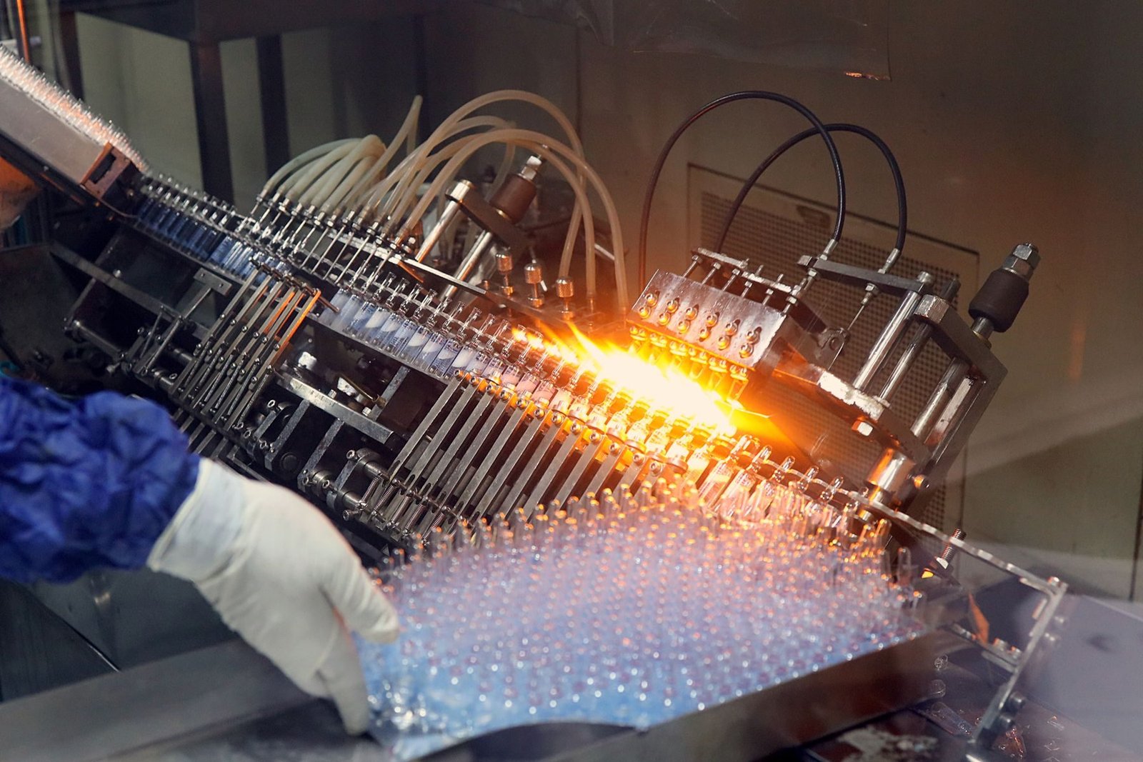
We read six months of trade material, sat in on two distributor calls, and found the decision was being made on perceived manufacturing rigour long before anyone read a claim.
The existing identity had been extended by six different vendors over four years. There was no master file, and no two packs used the same green.

02 — Define
The one sentence it turned on
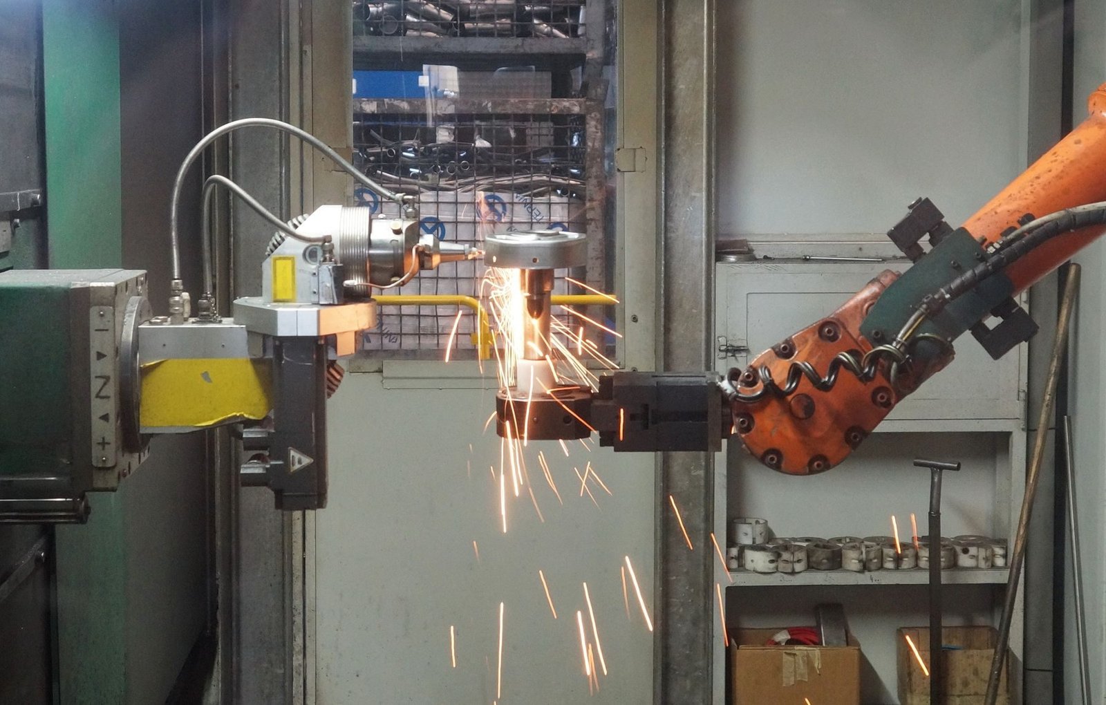
Look like the factory, not the pharmacy.
The one sentence it turned on03 — Design
The system is built from manufacturing documentation — batch grids, tolerance rules, specimen tables. Type is set tight and technical; the only warmth is a single ink-green that carries across packaging and screen.
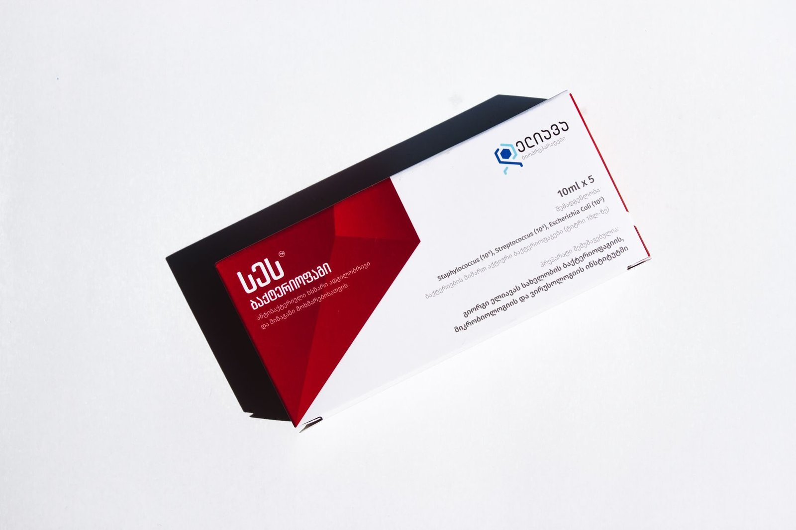
Every pack template is a grid the internal team can fill without a designer, which was the constraint that decided the whole system. Twelve product families, one set of rules, no exceptions requiring a call to us.
The site puts certification and manufacturing capability above the product catalogue, because that is the order a distributor actually reads in.


04 — Deliver
Identity, packaging system, trade material and a Next.js site with a CMS the regulatory team owns. Handover included a two-hour session and a written system, not a slide deck.
Six months on, the internal team has produced eleven new pack designs without opening a ticket with us. That is the outcome the system was built for.
“The first agency that asked to see our production line before showing us a colour.”


A manufacturing business explained to a European buyer

Property, without the drone shot


A category launch for a product that did not exist yet