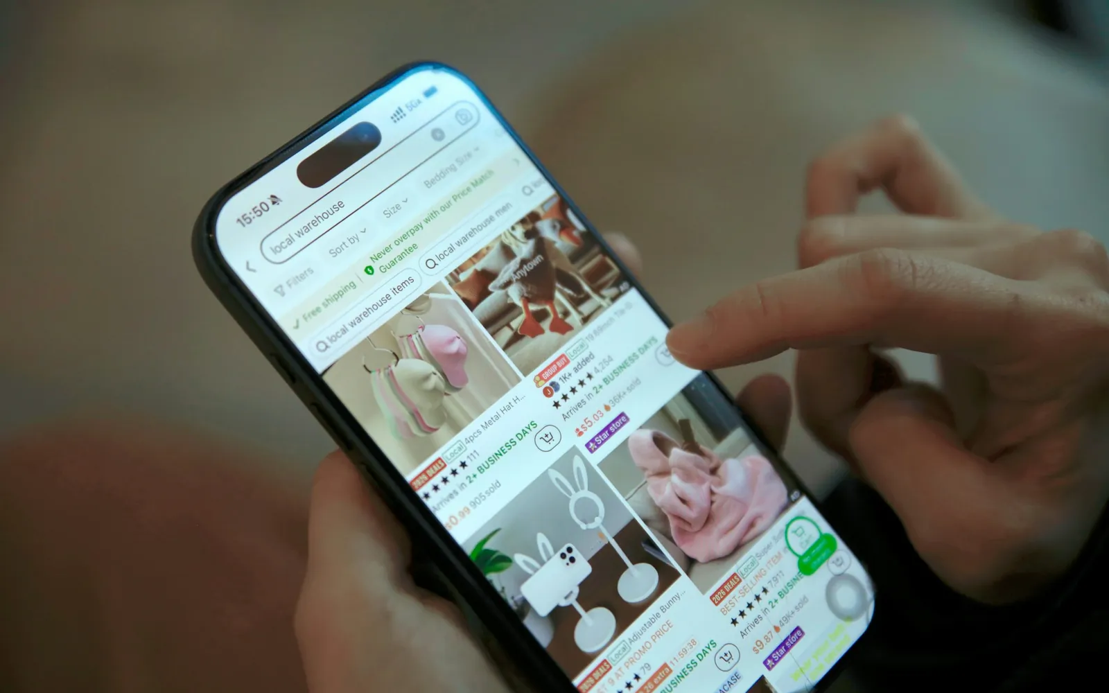

On Blinkit, Zepto and Instamart, most shoppers meet your product as a tile smaller than a postage stamp. A practical guide to designing packs and product images that still read at that size.
The shelf got smaller
In a supermarket, your pack competes on a shelf at roughly actual size, at eye level, under reasonable light. In a quick-commerce app the same pack competes in a grid of tiles, each about two centimetres wide on a typical phone, usually seen one-handed while the shopper is doing something else.
That second shelf is now very large. Datum Intelligence estimated that India’s quick-commerce platforms together passed 9 million orders a day in August 2026, with Blinkit, Zepto and Swiggy Instamart handling close to four-fifths of them. For snacks, drinks, personal care, home care and a growing list of impulse and gifting categories, the app tile is where many first impressions now happen.
Yet most packaging is still designed on a large monitor, printed at A3 for review and approved by people holding a physical mock-up. The thumbnail gets checked at the end, if at all. We think that order should be reversed.
What a shopper needs from a tile
GS1, the standards organisation behind the barcode, publishes guidance on Mobile Ready Hero Images, which grew out of work by the University of Cambridge’s Inclusive Design Group with Unilever. It reduces the job of a product image on a phone to four attributes a shopper should be able to identify:
- Brand.
- Product type: what it is, whether shampoo, juice or namkeen.
- Variant: flavour, fragrance, skin type.
- Size or quantity: 200 g, a pack of six.
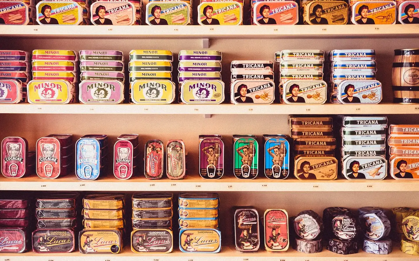
It sounds obvious. But open almost any category grid and count how many tiles let you identify all four without tapping. Variant is usually the first casualty: three flavours of the same chips look identical at two centimetres, told apart only by a word in tiny type. Size comes next. A 50 g and a 200 g pack photographed straight on are the same shape on screen.
The Cambridge work came with a commercial result. When the university announced the guidelines in 2018, Unilever reported that Magnum’s mobile-ready hero images produced a 24% sales increase in an eight-week A/B test with a retailer. One test on one brand won’t predict your number, but it shows how much money can hide in a small picture.
Fix the listing image, then the pack
There are two places to solve this, and most brands need both.
The first is the listing image. Some platforms let brands upload a hero image that isn’t a plain pack shot: the product slightly enlarged, the variant called out in a bold band, the quantity shown as a large number. It is the quickest fix and needs no reprint. Check each platform’s image rules first, because they differ and they change.
The second is the pack itself. Listing images get cropped, resized and sometimes replaced by a platform’s own photography. The pack is the one asset that travels everywhere: the app, the shelf, the unboxing video, the customer’s kitchen counter. If the pack reads at a small size, every photograph of it will too.
Designing a pack that survives the thumbnail
Lead with one distinctive asset, and make it big
Marketing scientist Jenni Romaniuk argues in Building Distinctive Brand Assets (Oxford University Press, 2018) that brands should build and protect a small number of assets that are both widely known and unique to them: a colour, a shape, a character, a way of setting the logo. On a tiny tile there is room for one. Decide which it is and make it large enough to survive. A logo sitting politely in a corner disappears.
Use colour to separate variants, not only to decorate
If every variant shares one dominant colour and differs only in a small flavour panel, the grid turns them into a single product. Give each variant a clearly different field of colour while the brand asset stays constant. Then check the set in greyscale, because not everyone sees the colour difference you designed.
Make the size impossible to miss
Quantity is a buying decision on quick commerce, where people compare price per pack in seconds. A large, simple figure such as “200 g” on the front, or a clear “pack of 6” band, saves a tap and prevents a wrong order.
Clear the front of pack
Claims, certifications, serving suggestions and promotional flashes all fight for the same few pixels. Mandatory information must be on the pack and labelling rules apply, but much of what crowds a front panel isn’t mandatory. Move secondary claims to the back or side, where the person holding the pack can read them.
Design for the photograph
A glossy black pack with fine gold foil can look beautiful in the hand and like a dark rectangle on a phone. Reflective films, very dark grounds and thin type all suffer under flat e-commerce lighting and image compression. Test with a real phone photo of a prototype, not only the render.
Two tests to run before sign-off
You don’t need a lab. Two simple checks catch most problems.
The blur test
Cambridge contributed a visual clarity check to the GS1 guidance that uses Gaussian blur to simulate how an image reads on a small display. You can approximate it in any image editor: shrink the front of pack to about 150 pixels wide, add a slight blur, and ask someone who hasn’t seen it to name the brand, product, variant and size. If they hesitate on any of the four, fix it before going further.
The grid mock-up
Take screenshots of your category on the two or three apps that matter most, then place your design in the grid beside real competitors, at real size, on a real phone. Look at it for three seconds. Does yours stand out, and for the right reason? It takes ten minutes, and it is the step we would least want to skip on any packaging job.
When the grid is busiest
Timing matters too. India’s festive season now runs from the Independence Day sales in August through Onam, Navratri and Diwali, and quick commerce plays a larger part in it every year. Medianews4u’s analysis of the 2026 festive season reported that ad slots on Blinkit and Zepto cost 30 to 40% more around Diwali. If you are paying a premium to appear in the grid during the busiest weeks, the tile you appear with should be pulling its weight.
Gift packs and limited editions need particular care. They often launch late, get photographed in a hurry and end up as the least legible tiles in the category, at exactly the moment shoppers are deciding fastest.
Start small, then scale up
None of this means designing a pack that only works on a phone. A good pack still has to feel right in the hand, hold its own on a physical shelf and photograph well for a campaign. The point is to check small first, because a design that reads at two centimetres almost always reads at twenty, while the reverse is rarely true.
If you are planning a redesign or a range extension and want the small-screen view built in from the first sketch, our Brand team can help. Tell us what you’re making.
Questions people ask
What are mobile ready hero images?
Product images adapted for small screens so that a shopper can identify the brand, product type, variant and size at a glance. The approach was developed by the University of Cambridge with Unilever and is set out in GS1 guidance.
How big is a product image in a quick-commerce app?
In a typical grid on a phone, each product tile is roughly two centimetres across. Packs and listing images should be designed and tested at that size.
How can I test whether my packaging works on mobile?
Shrink the front of pack to about 150 pixels wide, add a slight blur, and ask someone unfamiliar with it to name the brand, product, variant and size. Then place it in a real app grid beside competitors and look at it for three seconds.
Sources
- Blinkit Leads India’s QCom space as Average Daily Orders Shoot Up: ReportEntrepreneur India, on Datum Intelligence data, 18 August 2026
- Mobile Ready Hero ImagesGS1 Sweden, current guidance
- Newly developed image guidelines will improve mobile shopping experience worldwideUniversity of Cambridge, 7 February 2018
- Building Distinctive Brand AssetsJenni Romaniuk, Oxford University Press, 2018
- Festive 2026: Onam Starts The Clock, Q-Commerce Closes The SaleMedianews4u, 10 September 2026
How we wrote this. Figures in this article come from the sources listed at the end, which we read in full or, where a primary report was not public, from named coverage of it. Opinions and recommendations are ours.